
Who doesn’t love a good book cover? Nobody, that’s who! If you’re like me, you spend a fair amount of time browsing in book stores, in real life or online. And I think most readers will admit that the cover is the second thing that grabs them. I say second because the majority of bookstores and libraries have to put their books on display spine out, so title is often what people notice first. For me, when I am aimlessly browsing, a good title will make me pull a book off the shelf, and a good cover will make me turn it over. And if a book is on full-frontal display, the cover is what will get me every time.
I studied graphic design as a large part of my university degree, and my partner is a keen photographer. When I wrote my first book, I toyed with the idea of making my own cover, but I was lucky enough to score a traditional publishing deal and didn’t have to! However, the seed was planted, and instead of practising my website and poster design, I started thinking about book covers. Soon my partner and I had a pinterest board underway where we would pin awesome and inspiring covers. We started to make our own. Now we’re having a great time with a fun new hobby, and actually making some money.
What makes a good cover? It has to look good in thumbnail size, black and white (for most ereaders!) and represent your book. It needs to be interesting, but not cluttered (I recommend no more than four elements) and grab the reader’s attention.
So, let’s talk about the basics. If you want to make your own cover, you’ll need a graphics program like photoshop in order to create it. Photoshop has a complex interface that takes a bit of time to get used to, but you easily watch videos and teach yourself if you refuse to give up. Free alternatives like Pixlr are a good online resource if you are just going to make one cover.
To start with, you’ll also probably need access to a stock photography site like shutterstock. Remember, creative commons (licensed for commercial use and modifications) images almost always have to be appropriately credited, and if you use a picture you have found online without checking the source and license information, you could be breaking the law. If you use a photograph or drawing that is your own intellectual property, this won’t be a problem, and you’ll know your image is unique.
Research is important! Make sure you scan the amazon lists for your genre, what is selling right now, what colours are popular, pay attention to fonts. I have noticed a large trend toward illustrations on book covers instead of photo realistic images, and I think that is part of the huge upswing in self publishing, and personal cover design. It costs hundreds, sometimes thousands of dollars for an illustration, but using stock photography to make a cover only costs a few dollars.
Finding a font for your cover is often the most difficult part, and the area where I see inexperienced designers messing up the most often. Top tip number one! Experiment. Put the focus words in a bigger size. Try both serif (with little lines on the edges of letters) and sans serif (no little lines) Download a font from a freeware site (make sure to check each license carefully and make sure you can use it for commercial use) like dafont.com and use that. Some current popular fonts are shown below. A book cover totally changes with the font that is placed on it.

Photoshop basics- you might not be a design pro, but a few things are very simple and add a huge amount to a cover image.
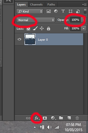
- Look at your layer pallet (usually on the bottom right, where you can see a thumbnail of your image, and on top of it, each layer of text or extra image) You’ll see a small button ‘fx’- as you might guess, that means ‘layer effects’. You can use this to add a glow, or shadow to your text. This helps make it easily readable.
- Layer Styles- also in the layer pallet, at the top, you’ll see a drop down menu that says ‘normal’ next to an opacity slider. Try flicking through those styles for your text, and you can achieve some very cool effects as the layer interacts with the colours behind it.
- Opacity slider- if your text is too bright, try lowering the opacity to make it more translucent. This can help integrate the design.
- Brushes- photoshop comes with a lot of brushes, but did you know you can get a brush that looks like a dinosaur? A cloud? A pentagram? Try googling ‘free photoshop brush *keyword*’ and see what you can come up with.
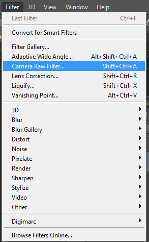
- Camera Raw Filter- under filter (or press Shift+ Ctrl + A) this will bring up all of the basic adjustments you might want to make to an image including hue, saturation, brightness and contrast.
And finally, don’t forget, google is your friend! There are step by step guides for almost anything you might want to achieve in photoshop, all available for free.
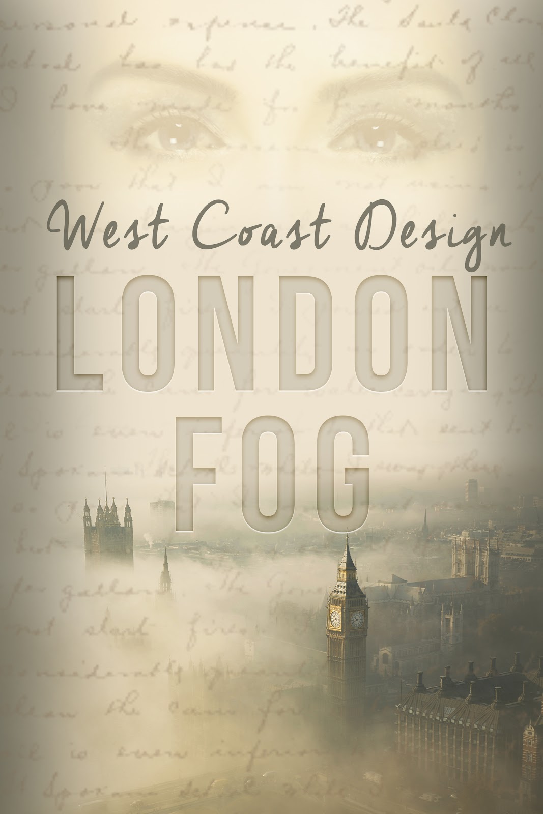
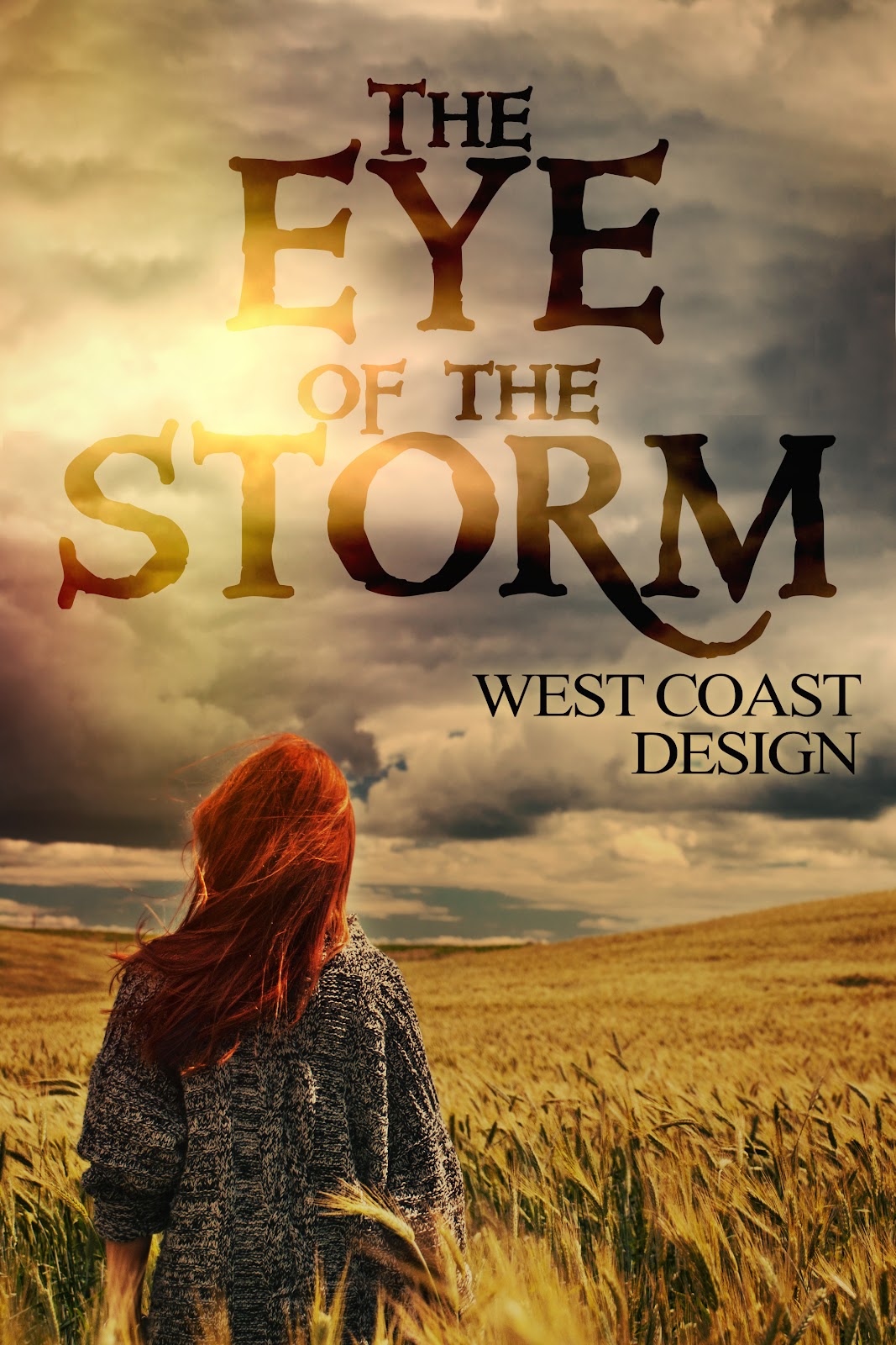
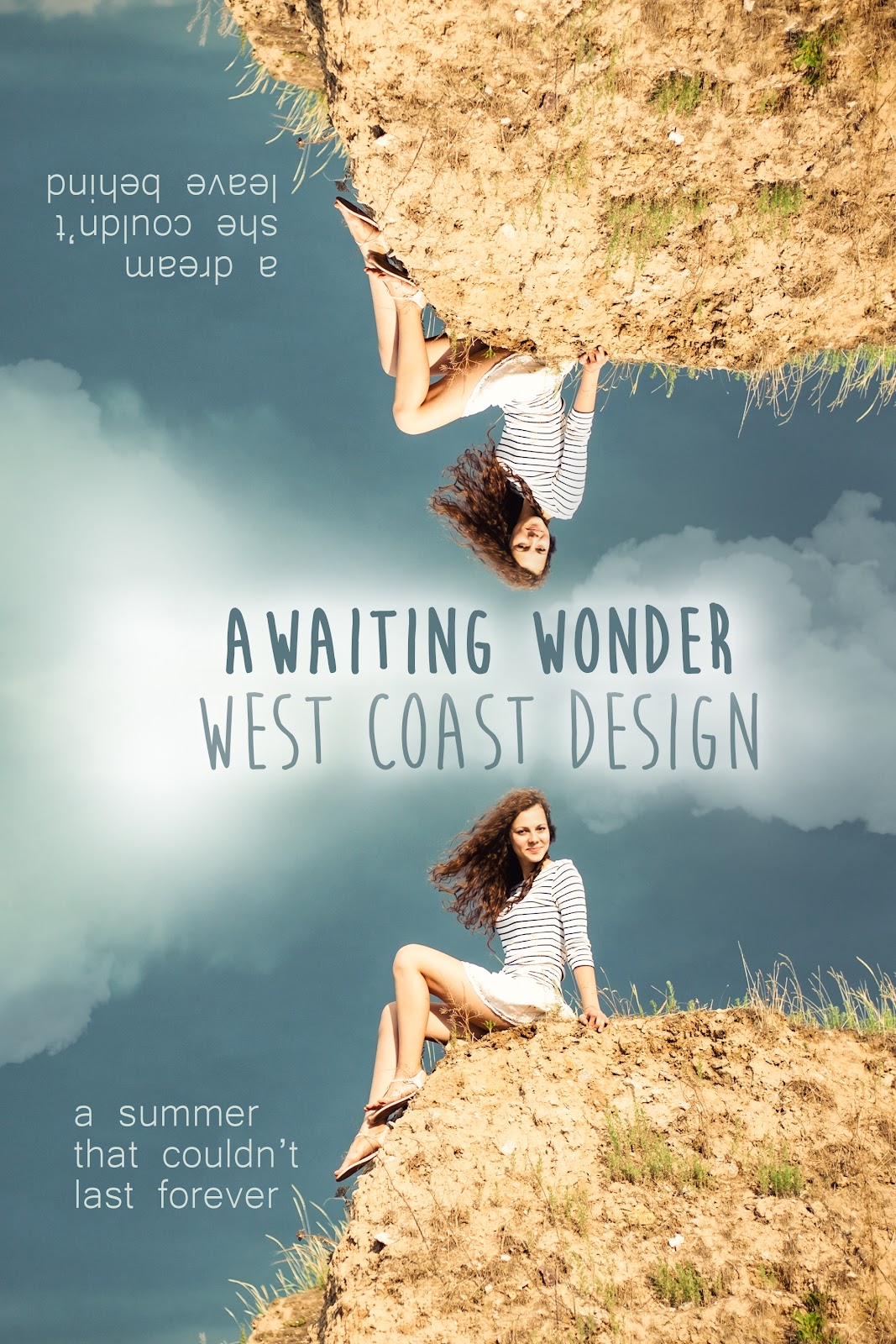
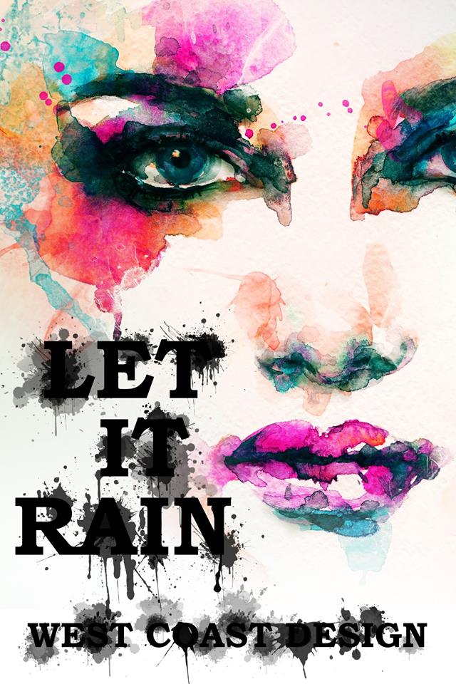
Here are some samples of our designs, and we’d love it if you stopped by our facebook or checked us out on selfpubbookcovers or thebookcoverdesigner


All covers designs very beautiful.
ReplyDeleteLogo Design
HEY!
ReplyDeleteVisit our site for many beautiful logo designs with 5O% off I expect You will be happy with us.Logo Designers
this is such a great blog I ever say thanks for sharing it with us...
ReplyDeletewe surely can help you if you have an interest in web designing or logo designing then visit us?
Logo Designers